Comics to Film (And Halfway Back Again): A DVD Essay
by: Drew Morton / UCLA
IN ADDITION TO OUR REGULAR COLUMNISTS AND GUEST COLUMNS, FLOW IS ALSO COMMITTED TO PUBLISHING TIMELY FEATURE COLUMNS, SUCH AS THE ONE BELOW. THE EDITORS OF FLOW REGULARLY ACCEPT SUBMISSIONS FOR THIS SECTION. PLEASE VISIT OUR “CALLS” PAGE FOR CONTACT INFORMATION.

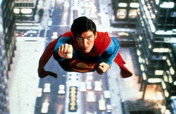
Superman
Being an avid reader of comic books and graphic novels and taking a closer look at cinematic adaptations of such materials, two aspects struck me like a good old Superman punch to the face. First, when and how had comic book adaptations began to take on the aesthetics of its source? Looking back at the 70s and 80s, most specifically Superman (1978) and Batman (1989), adaptations commonly took the source material (Bruce Wayne=Batman, rich millionaire, dark side, parents killed by criminal) while leaving the formal characteristics (panels, splash pages, spatial direction) at the wayside. Contrast these adaptations to films like Sin City (2005) and 300 (2007), both of which have been touted as being the cinematic equivalent to the original, both in terms of style and content.
Secondly, why had few scholars within cinema and media studies taken a closer look at comics? As Erwin Panofsky once wrote, “The comic strips–a most important root of cinematic art.” Regardless of this similarity, aside from pieces comparing comic books to storyboards and discussions of fan culture, critical study of the medium has almost exclusively come from workers within the industry: Art Spiegelman toured various college campuses on a lecture tour entitled “Comix 101,” graphic artist Scott McCloud published two books of theory between 1993 and 2000, and Chris Ware guest edited a volume of Timothy McSweeney’s Quarterly Concern focusing solely on graphic art in 2004. Are comic books so similar to storyboards and film that they can be dismissed? Taking a cue from Art Spiegelman who quipped “Comics are not storyboards for movies at their best,” I would argue not.

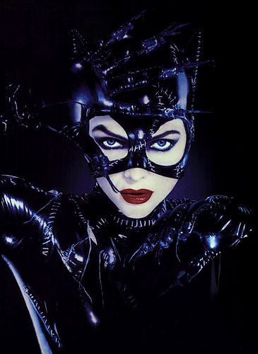
Catwoman
I do not believe this oversight stems from an issue of high/low culture but rather the a lack of a theoretical vocabulary. After all, it’s not that comics have been ignored by those within the academy. Aside from the fan studies and comics as storyboards, Henry Jenkins has looked extensively at comic books as a form of trans-media storytelling and the last three annual Society of Cinema and Media Studies conferences have all featured panels regarding comic books. No, this isn’t an issue of high/low culture or complete ignorance but rather a redirection.
Taking these two thoughts, I began working on a paper for a seminar on media convergence I was enrolled in. During this time, I was also enrolled in a workshop with the end goal of producing a DVD essay. I had begun by segregating the two pieces. While I was working on the comic book adaptation paper for the convergence seminar, the DVD essay was going to be my visual crutch for my SCMS paper on American independent film and Steven Soderbergh.
However, this is not the path this project ended up on. My comic book paper was becoming far too visual to just throw a couple of still images into the blocks of text and, conversely, my indie film essay was perfectly fine on paper. Moreover, while I was researching the comic book project, I came across Scott McCloud’s Understanding Comics, which I had been familiar with but never completely engulfed myself in. I found McCloud’s approach, to ground a working theory of comic books into the medium itself, the main source of inspiration, creating a large, explosive, thought bubble over my head.
As the project progressed, I realized that it would be ideal if the two projects would supplement one another. The visuals of the DVD could fully exemplify what I was attempting to describe, rather poorly, on paper while the analysis of the paper could elaborate on a utility belt full of topics that time and technological constraints had forced me to cast aside in favor of the viewer’s ability to audibly sort through much of the theory and quirks of the comic book medium (hence my attempt to make the visuals of the essay re-enforce the audio track). While both pieces function rather well on their own after extensive re-working, they both buckle to the constraints of their respective mediums, which one can only expect.
After the essay was completed, I had a lively discussion with my cohort (fellow Flow-ite Adam Fish included) regarding the reception of such pieces. While much of this discussion circled around issues of fair use, many of us shared the lament that, aside from an interactive conference paper, there lacks a venue for visual essays. While media studies publications often pride themselves at being ahead of the curve by diving into popular culture and new technologies, the only magazine to come out with a DVD of visual essays and short films (to my knowledge) has been Wholphin, the quarterly DVD magazine from Dave Eggers and the crew at McSweeney’s. However, if YouTube and the nickelodeons of the internet have shown us anything it is that there is a outlet for anything: be it Channel 101’s Yacht Rock or the video diaries from Iraqi soldiers. Why shouldn’t those within cinema and media studies throw their hats into the A/V ring as well?
While such a format may be dismissed on the grounds that only technophiles are able to grapple with the interfaces of programs like Adobe Premiere and Final Cut Pro, the technology, while frustrating at times, isn’t that fickle. Moreover, one could easily use iMovie or the standard Windows equivalent to cut together an essay. The only advantage to using a higher-end product lies in the bells and whistles and there volumes of “How-To” guides filling bookshelves at Borders that explain how to master these techniques much more eloquently than yours truly.
All aspects considered, perhaps the most beneficial is that by constructing visual essays, cinema and media studies scholars dip their hands into processes they think and write so much about. Why should theory and criticism be separate from filmmaking? As Sergi Eisenstein and Jean-Luc Godard have demonstrated, there is much to gain from the pairing of theory and praxis.
Useful Links:
1. Download Free Golden Age Comics
2. IGN: “300 in Film.”
3. IGN: “Best & Worst Comic Book Movies.”
4. IGN: “Building the Ultimate Bookshelf.”
5. Milwaukee Journal Sentinel: “Comics Jump to the Screen.”
6. Scott McCloud’s Webpage
7. Time Magazine’s Comix
8. UWM Post: “High and Low.”
9. Wholphin
10. Winsor McCay’s “Little Nemo” Short
Useful Image Links:
1. 300
2. American Splendor
3. Batman Animated
4. Hulk
5. Sin City
6. Superman Returns
Image Credits:
1. Superman
2. Catwoman
Please feel free to comment.
While I would certainly agree that these multi-media versions of theorizing would be beneficial, I can’t help but have reservations — not about the utility of these practices, but about the potential danger for academics who may find themselves dancing around some extremely sticky copyright issues. It would only take 1-2 semi-serious legal threats from copyright holders to squelch the practice. The cost of doing these types of things legally (which Henry Jenkins touches on in Convergence Culture) is frequently astronomical, both in terms of money and in time.
Thank you for this wonderful essay. I admit that your column inspired me to rent Sin City again and think more about the comic adaptation. Having seen Art Spiegelman present during his tour for In the Shadow of No Towers, have you seen yet film adaptations of comics that emulate more contemporary panel styles (those that stray from the standard left-to-right/top-to-bottom reading approaches), as seen in Spiegelman’s work?
Carly,
I agree that the legal areas are rather sticky and I’m excited to see if the upcoming Cinema Journal on fair use begins to address these questions. With this being said, I’ve spoken to quite a few people on the issue and most just respond with “Well, who would sue a university or academic for copyright restrictions?” I believe UCLA is looking into the matter (we offer two courses on constructing these essays) because they want to give students a legal outlet. On the other end, we can always use these essays at conferences…
Thanks for your thoughts!
Marlene,
While I am rather limited in my scope, I’ve heard (although not had time to see) that “Blade 2” indulges in the aesthetic on a more Miller/Spiegelman basis. “300” indulged in an almost hybrid of flattened/composed/widescreen. I’m sure with such styles beginning to bloom that it’s only a matter of time before the adaptations (and films in general) take to a more contemporary style.
Thanks again for reading.
Best,
Drew
Drew says: “While much of this discussion circled around issues of fair use, many of us shared the lament that, aside from an interactive conference paper, there lacks a venue for visual essays.” I urge readers to look at the new online-only, multi-media scholarly International Journal of Communication [http://ijoc.org], as we would be delighted to consider submissions of visual essays of the sort discussed here. The possibility of publishing such work was one of the motives for founding the journal.
Larry Gross, Editor, IJoC
Pingback: Tama Leaver dot Net
If anyone is interested, I’m working on putting a panel together for the 2008 SCMS Conference on the aesthetics of comic book adaptations.
The deadline is August 10th. Feel free to contact me with any questions!
Type of Posting: Panel
Proposed Panel/Workshop Subject: Comics to Film: Issues of Adaptation
Organizer Name(s):
Drew Morton, University of California-Los Angeles
E-Mail Address: DAMorton@ucla.edu
Summary: Since the release of Tim Burton’s BATMAN (1989), adaptations of comic books and graphic novels have become more and more prevalent throughout the cinemas of the world. The past three years has seen critically acclaimed and financially successful adaptations of a broad range of texts ranging from rather conventional sources like superheroes and the fantastic (BATMAN BEGINS, SUPERMAN RETURNS, and the SPIDERMAN and X-MEN franchises) to more sophisticated subject matter (A HISTORY OF VIOLENCE, SIN CITY, 300, and the upcoming PERSEPOLIS).
While previous panels have explored the capital of comic books and comic book culture in general, I would like to propose a panel with a focused discussion on issues of adaptation beyond textual fidelity in the hopes of further exploring the ties between two very similar but distinct visual/narrative forms.
Send individual topics & summaries to organizer(s) by: E-Mail
Very interesting essay, but film makers have been employing comic book aesthetics since the sixties. Take a look at Danger: Diabolik and it’s innovative framing and compare it to a more static comic book film of the time: Barbarella. One could also argue that the split screen films of the 60’s like Thomas Crown Affair and Woodstock as well as the films of Brian de Palma could be inspired by the multi panel comic book page.
where can I get the pictures batman animerad 1 to 5